There are many conversations that take place behind the scenes in survey measurement and development and most don’t resonate or matter to end-users. Even for survey designers and researchers, some are best relegated to drunken arguments after work. But others are important, even if the respondent doesn’t understand or even care about them.
Respondents will sometimes notice or inquire about directionality of survey response scales1 or question order2 and these are things that survey designers take seriously as well. But one thing that gets less attention from survey-takers and survey-designers alike is the increasing use of interval question scales.
First a bit of level-setting for those who don’t know about question scales and because the definitions have nuanced differences in different measurement circles. For the purposes of this conversation, there are three types of question scales.3
- Nominal Scales: These are scales of attributes, whose order is not important. So, gender, race, ethnicity, religion, all have discrete values, but the ordering of them has no meaning. So listing religions as Catholic, Islam, Jewish, Protestant, None, Other, makes no statement about whether one is better or more important than another. They are all simply categories.
- Ordinal Scales: These are scales where order is important, but the degrees of separation are not defined. A scale that asks someone to rate an experience as Excellent, Very Good, Good, Fair, or Poor assumes that one answer is better or more valued than another. The difference between the categories, though, is not defined. We all can agree that Excellent is better than Good, but we cannot quantify how much better and we accept that it likely varies from respondent to respondent.
- Interval Scales: These are scales where order is important and the degrees of separation are defined. So, rating something on a scale of 1-to-5, where 5 is best, we know that 5 is better than 4 and it is better than 4 by exactly 1 while it is better than 3 by exactly 2.
Now, if you have already had a MEGO moment, my apologies. But survey design nerds have long conversations about how a scale can impact the results one will get and what sort of analysis can be legitimately performed on the data.4
I, personally, am partial to the use of ordinal scales, though I am aware that one significant criticism of ordinal variables is that they are subject to respondent interpretation. For example,
- Is “Excellent” a lot better than “Very Good” or a little bit better?
- Does “Excellent” mean “Perfect” to people?
- Is the distance between “Excellent” and “Very Good” the same as between “Very Good” and “Good” or even “Fair” and “Poor”?
People will criticize ordinal scales, then, because while one can talk about relative differences, it is difficult to quantify those differences between different populations or even differences between one person’s response to different questions. I don’t disagree with these concerns. 5 Ordinal scales don’t have any precision and just like Justice Potter Stewart’s definition of pornography, respondents will say that they cannot define Excellent, but they know it when they see it.
This is, though, why I overwhelmingly prefer ordinal scales. It wears its deficiencies on its sleeve. Meanwhile, interval scales are preferred by some because the difference in scale has consistency and is measurable. But this is only the illusion of accuracy. A measure that boasts a linear hyper-rationality fails because humans are not hyper-rational or linear. This deceives researchers into thinking that they are capturing something useful, but are really assigning weight to a measure that cannot support that weight.
The four concerns discussed here at-times blur the line between the scales themselves and how they are used and the assumptions they are laden with. All though, reside in the notion that humans—both survey-takers and data-reviewers—are not sufficiently rational to use them effectively.
More is not better
One element of interval scales that researchers like, is the ability to easily build them with nuance. A respondent may be confused if presented with eleven descriptive statements to capture their mood (Do you support this “a bit”, “a tad,” “a a bit more than a bit,” “more than somewhat but not a lot”, etc.) but can completely understand “On a scale from zero to ten…” Creating a raw-number responses is easily scalable to need. While there may indeed be areas where a more expansive scale is valuable, there is no evidence that having lots of survey responses is better at measuring human feelings. It is true that anyone who has gathered survey data knows that there is always someone out there who will be unhappy with the scale. On a scale of zero-to-ten, they will say, “7.5”. The implication, then, is that the scale should be more nuanced, broader, to allow respondents to find the ‘perfect’ response. So, 5-point scales morphed into 7-point scales. Then 7-point scales morphed into 11-point scales. These for a time morphed into 101-point ‘feeling thermometer’ scales, though cooler heads and degrees of freedom issues have prevailed on this.
The perceived nuance by the survey-designers is generally not appreciated by the survey-takers, with people retreating to the comfortable poles of ‘happy’ and ‘sad.’ On the HCAHPS scale, for example, what is to be made of the fact that 0 is generally a more popular response than 2 or 3? Is it true that people are more likely to have a completely unredeemable experience than one that is mostly bad, but has some glimmer of good? Or is it that dissatisfied people are not going to split hairs about the quality of the third phlebotomist that they saw, when they were generally very dissatisfied with the experience? One of the reasons that 101-point scales died was because the number of 70, 80 or 90 responses dwarfed the number of 79, 82 or 91 responses, so that sense of precision was not appreciated by respondents.
Populations are not consistent
Stripped of any guidance, people do not have a consistent definition of what these numbers mean. Go to the people around you, show them the 0-to-10 scale, and ask them these questions.
- What is a 10?
- Some will say “Best Possible” because that is what the cue on the survey says.
- Some will say “Best available” because they are comparing it to other providers in their community.
- Some will say “Perfect” and generally will follow this with an “I never give a 10, because there is always room for improvement.”
- What is Average?
- Some will say 7 because that was what a C was in school.
- Some will say 5 because it is in the middle.
- Would you ever give a 0?
- Some will if the experience was clinically and perhaps criminally bad.
- Some will if people were ruder or worse than they expected.
- Some will never give a 0 because there is always something redeeming in every experience.
Even though the numbers are the same, the emotional weight given to them varies from person to person. Are there general consistencies? Absolutely. But consider the two people who both consider an experience as ‘average’ but give it a 5 or a 7. They will be classified differently in a Net Promoter calculation. And this doesn’t even start to cover the folks like me, who KNOW that someone is looking for a 9 or 10 on an 11-point-scale, so my giving of an 8 (when appropriate) is intentional. I once gave an 8 to a survey BECAUSE I wanted the organization to contact me to discuss my score. (PS: They did.)
People are not internally consistent
Even individual respondents are not consistent in their ratings between questions. Because they saw one doctor and a dozen nurses, a patient may decide that it is harder for the nurses to get top scores because there is more room for error. Or they may hold the nurses to a lower standard because there were so many of them, while the doctor stood alone.
Often the questions have them reframe the scale as they go. Forgive this broad and perhaps silly example, but it will make the point clear. Imagine taking a survey about rating ice cream flavors on a scale of 1-5, where 5 is best. The first flavor you rate is chocolate and you think, “I do like chocolate. It might not be my favorite flavor, but it has to be up on the list” so you give it a 4. Then comes vanilla. You say, “Meh, vanilla doesn’t do anything for me, and it is not likely to be my first choice, but I can think of other flavors I like less than vanilla” so you give it a 2. Then comes black garlic.6 You say, “OMGOMGOMGOMG! Hard pass! Ugh.” So, you give it a 1. But then you are rethinking your vanilla response. Is vanilla really only slightly better than black garlic? No! But if vanilla gets a 3, is it really almost as good as chocolate which got a 4? So maybe chocolate gets a 5. But what happens when rocky road gets asked, which is really your favorite ice cream? Most people won’t spiral down a rabbit hole comparing their responses mid-survey, but they will quickly realize that the numbers are more ordinal suggestions and hard and fast empirical numbers.
People are not accurate even when they can be
People are not likely to offer the level of precision that an interval variable can support even when they can provide that level of precision. In my previous life, the research firm I worked for would do Community Health Needs Assessments. These were giant surveys that would ask people in a community about all aspects of their lives—how much exercise they got, their mental health, their access to healthy food and recreational spaces. These deep dives would then allow communities to consider how to best address their community’s needs. To calculate a respondent’s body mass index (BMI), the survey would ask for a person’s height and weight. (This was done in a way to not tip them off to the fact that we wanted to evaluate their obesity.)
Now, one would expect, if one looked at the last place in a person’s weight, to see an even distribution across 0-to-9. This means, that while we would expect someone to more-likely weight somewhere in the 100- or 200-pound range, than, the 400- or 500-pound range, we should expect to see an even distribution that last number. We might be surprised if one hundred respondents all weighed 223 pounds, versus some weighing 221, 222, 225, or 226 pounds. Random chance would indicate that there would be an even distribution (10%) within the ten possible final digits. But what we consistently saw, regardless of the year or the community, was that over 75% of people responded with a weight that ended with either a 0 or a 5 in that last place. So, everyone weighed 225 pounds and not 224 or 226 pounds. The same was seen in the height variable as well. Looking only at the inches, one would expect a random distribution (8.3%) between those who were X feet, 0 inches tall and those who were X feet, 11 inches tall. But, again, across different years and different studies, over 40% of people had zero-inch or six inch heights, as in X-feet tall or X-and-a-half-feet tall. Also telling was that only about 1% to 2% of people were X-feet-11-inches tall. So even with a question that is clearly definable like height and weight—a measure perfectly created for an interval scale—humans did not answer that way.
Now this has less to do with people being self-delusional and more with people retreating to the easy round number. (OK, maybe some of those six-foot guys are being delusional about really being 5-feet-11-inches.) But either way, what does this say about the interval scale? It only works if people are empirical and accurate, but we see that people are not.
Surveyors self-deceive
I am not the first person to point out that people don’t have consistent approaches to what a 10 or a 8 or a 5 is. Many survey designers will try to shade this, buy assigning values to those numbers. As mentioned above, HCAHPS puts boundaries on their 11-point rating scale by attaching “Best Possible” and “Worst Possible” to their 10 and 0 scores. Others are more prescriptive with their definitions.
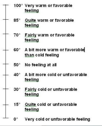
What surveyors have done, though, is change how people evaluate the scale. By putting words next to numbers, they are encouraging respondents to consider the words instead of the numbers. Instead of providing a number, respondents are picking a sentiment and then providing the number associated with that sentiment. So, survey designers have turned the interval scale INTO an ordinal scale. Notice that the 101-point has added “very”, “quite”, “fairly” and “a bit.” These are ordinal evaluations with no clearly defined distance between a “very” response and a “quite” response. Further, the scale assumes that the favorable and unfavorable sides have the identical distances, so the difference between ‘very cold’ and ‘quite cold’ is the same as between ‘very warm’ and ‘quite warm.’
A less charitable person might to a victory dance, seeing as the survey designers have accepted that people have ordinal brains and not interval brains. But this isn’t about me being right, so much as it is about social science researchers being honest with how our target audience views the world. When we accept how humans evaluate the world and meet them where they are comfortable, we can also address collateral mathematical issues that come from treating ordinal measures like they are interval measures.7
The biggest of these is assuming that the data us useful as a linear measure, meaning that movement along the scale is uniformly valuable. The whole concept of a net promoter score challenges this, since moving a respondent from a 5 to a 6 IS less valuable than moving a respondent from an 8 (neutral) to a 9 (promoter.) If measurement experts are inadvertently confused on this point, how can we expect front-line users to build appropriate action plans appropriately?
1The HCAHPS scales are read to the respondent as “Would you say: Never, Sometimes, Usually, or, Always” (negative-to-positive) rather than “Would you say: Always, Usually, Sometimes, Never” (positive-to-negative). If you don’t see a difference between these two, or, don’t care, well, I apologize in advance for the navel-gazing that you will be subjected to.
2This is more complicated than it might seem, since grouping questions by subject matter (all doctor questions together, all nursing questions together), and grouping questions by like scales, (Never-to-Always, or 0-10) both have value. And then there is whether you want to ask the Overall Question first or last. Oh, so much fun can be had by having these conversations. Fun that I will not be having today.
3My scientific research friends will want me to discuss a fourth type of scale, the ratio measures, but I will remind them that their social science research buddies are not that smart. They will be happy with this response, even if it isn’t true.
4I say “legitimately” here because I have seen all sorts of crazy analysis that either accidentally or purposely uses data in ways it was not designed to support. Honesty requires that I acknowledge that I have also assumed normal distribution against all logic just so I could run certain tests on certain datasets.
5I am amused that the phrase “I don’t disagree with you” has become this weird passive-aggressive corporate-speak for “I agree with you, but I don’t want to give you the satisfaction for being right.”
6Before you think I am setting up a false example, google “black garlic ice cream.” You will not find one recipe for it. You will find over ten recipes for it.
ate over vanilla at the same rate as vanilla over garlic?
7My fellow math nerds know that ordinal data is not likely to be normally distributed or linear, so any analyses that assume either of these things are flawed from the beginning. It doesn’t take long when breaking this data out in crosstabs before you get into degrees-of-freedom issues as well as cells that have fewer than five responses.

Leave a comment