Those who know me know that as passionate as I am about the patient experience, I am equally passionate about measurement of the patient experience. I don’t write about it as much because I am not sure my audience is as interested in it as I am. But yesterday, I came across a blog post that was the most blithely ignorant writing about survey research that I have ever seen in social media.1 So, in an effort to light a candle rather than curse the darkness, I will start a series on the values and challenges in running surveys, interpreting results and discussing survey research with audiences.
One of the biggest impediments to reaching an audience about what patients say is the preconceived belief that the data collected is not truly representative; that it is for some reason not representative of ‘the average patient.’ The topic today is the myth that ‘only angry people take surveys.’ This mistaken belief, like many, starts with an idea that has truthiness. For those not familiar with the word, it was coined by Stephen Colbert to describe something based on gut intuition, emotion, or desire for it to be true, rather than on facts, evidence, or logic. So, it is not true, but it feels true. Not surprisingly, when you start with something that only feels true and then extrapolate from that, you are deep in the heart of mythology.
Statisticians often struggle to combat these myths because while they can explain statistics and research in appropriate terms, they often fail to convert these concepts into language that makes intuitive sense to an audience who already has intuitively sensible misinformation in their heads. This inability for statisticians and presenters to refute falsehoods conversationally, though, often dulls their message.
People make assumption based upon their behaviors and then extrapolate that assumption onto others. Let us look at the most common logic when it comes to the assumption that only angry people take surveys and that average patients don’t take surveys.
- Participating in a survey involves costs, mostly in the time dedicated to answering questions. Not everyone has the same amount of time or chooses to use that time in the same way, so not everyone is equally likely to participate in a survey.
- People driven by passion are more likely to dedicate time to answer survey questions than those who are less emotionally connected.
- ANGER is more likely to fuel the desire to participate than LOVE.
- Therefore, angry people will be far more likely to take the survey than happy or neutral people.
Let us look at this logical flow. Like a lot of myths, this one starts with a solid first step. It takes time to take a survey and especially when a survey is long (HCAHPS has 32 questions), not everyone will have the time, patience, attention-span, or general interest to take that survey.
Where this logic starts to falter, though, is that it assumes that the only (or the most important) reason why someone would take the survey is a passion for the topic. This is at best a radical dumbing-down of all the reasons why someone might or might not take the survey. My research indicates that the following reasons are just as likely, if not more likely, to predict why a person may take a survey. There may be post-discharge medical reasons (like recovery or being a new mom), structural reasons (like physical or mental disability, or being limited-English proficient), or methodological reasons (people not being comfortable with taking a survey on-line, or finding Interactive Voice Response surveying (IVR), less charitably referred to as robocalls, off-putting. When I investigated complaints from patients who reported that they didn’t get the survey, I discovered that they actually did get the survey. They just didn’t answer the phone because they did not recognize the number, accidentally tossed the mailed survey away with other junk mail, or gave the hospital an email address that they don’t regularly use. So, while we may all agree that passion could be one of these motivating or demotivating elements, positioning it here in this logic to the exclusion of other elements feels simplistic and designed to “salt the deck” to a specific conclusion.2
When they cite anger as a stronger motivator than love, the speaker may be telling us more about themselves than the public at large. While it can be a strong motivator for some people in some situations (as a Cub fan, I might admit some antipathy towards Cardinal and White Sox fans), it is unclear that most people act out of anger most of the time. While people will talk about hate-watching a TV show or sporting event, I have not heard of anyone hate-surveying.3
This myth survives primarily because it feeds the narrative that I cannot be held responsible for survey data that says that I suck, since people are just hurtful meanies. If you are one of those who believe this or are forced to talk to audiences that believe this, let us examine this myth using actual data. If this premise was true, we should see two things present in the data. First, there should be significant percentages of respondents who hate whatever thing is being surveyed. Second, when looking at survey data, we should see a bimodal distribution of responses. If passion drives participation, we should see big percentages giving high and low scores and very low percentages in-between. Let us examine these two elements.
Everyone is Angry
If hate is stronger than love, we should see large portions of respondents giving low scores in surveys. I use the word “hate” here has a linguistic short-cut for what net-promoter scores call detractors or those who, on an 11-point scale, will give a score between zero and six. This, in contrast to the passive or neutral crowd will give a seven or eight and the promoters will give a nine or ten.
I took the most recent data from CMS4 and built out percentiles on those three categories for Overall Rating. The table below shows the scores for a variety of percentiles. [Note that each grouping was set independently, so you should not expect the lines to add up to 100%.] When we look at the results, we simply do not see a lot of angry people. Sure, the worst hospital in America (based upon this question) has 48% angry patients. Notice, though, that this is an outlier. The detractor population is cut in half at the 1st percentile. Once one gets past the worst quartile, we see that only 11% of patients are angry. The median hospital has only 8% of patients being irate. So, where are all these crabby survey takers inundating hospitals with their tsunami of hate? Yes, poorly-performing hospitals have upset patients, but for this myth to have value, we should see this across the board. This data instead tells us that we have patients honestly giving bad hospitals bad scores. It also shows that patients will honestly give good hospitals good scores and mediocre hospitals mediocre scores.

We don’t even see this trend outside of healthcare. I did a quick internet search and discovered that nation-wide 83.7% of people are satisfied with their experiences at the post office. Further, 69% of people nation-wide are satisfied with their experiences at the department of motor vehicles (DMV). These are two places whose customer service is the punchline for jokes and even they have two-thirds to four-fifths of their customers satisfied with the service they receive. If these two agencies don’t engender hell-fire survey results, one might have to accept that angry people are NOT more likely to take surveys.
Bimodal Distribution
Even if hospitals are good at providing service and we cannot expect everyone to hate them, the passion-drives-participation logic should still create a universe where everyone should be a lover or a hater, and no one should be in the middle. In the table above, though, that is simply not true. The median hospital has 20% of their patients categorized as neutral. Based upon this logic, 1 in 5 people have no business taking the survey.
To better control the relative representation of each group, I calculated the net promoter score for all 3,935 hospitals with data reported and then calculated the percentiles for NPS. In the data below, I added the NPS percentiles to the other percentiles. Again, we simply do not see data to support the claim of bimodal distribution. Consider the median hospital. If we expected a bimodal distribution and 72% of the patients loved the hospital, then we would expect the remaining 28% to hate the hospital and the NPS to be 44%. But it is not. The median NPS is 64% and this tells us that there is a large chunk of patients who exist somewhere between love and hate. Further, the hospitals at the bottom end should have a negative NPS. Since they don’t have a lot of promoters, the remaining detractors should overwhelm the calculation. But, again, outside of that one hospital, even the hospitals at the bottom of the scale have decidedly more happy patients than unhappy ones.

Now one might push back at this, claiming that their argument is that only happy and unhappy patients take the survey, not an equal number of happy and unhappy patients. So, I added one more, perhaps more complex, percentile. For every hospital, I calculated the number of neutral patients for every dissatisfied patient. This ratio, labeled N per D, meaning Neutrals per Detractors, shows the number of neutral patients for every patient labeled a detractor.
At the very bottom, there is a hospital that only got 0.14 neutral responses for every detractor response. This works out to over seven detractors for every neutral patient. But, at the 1st percentile this number goes even, as 0.9 translates into approximately 1.1 negative responses to 1 neutral response. From here, it climbs quickly. By the 25th percentile, there are 2 neutral responses to every negative score. The median goes to 2.6 neutral responses to every negative response. At the top end, since there are NO negative scores, it is impossible to calculate the ratio. So contrary to the myth, there are many patients taking the survey who neither loved nor hated their experience. The bimodal model collapses under this reality. For a vast majority of hospitals, the number of detractors is negligible against the number of neutral responses. This is why my battle cry will always be “8s-to-9s!” meaning that the path to success was not about worrying about the detractors, but by focusing on the neutral folks.
I made a lot of pretty graphs to go with this essay, most of which I cut because the boring tables told the story more clearly. But below is one graph that illustrates the fallacy of the bimodal population with a different visual. I counted the observed percentages of each category for each hospital and plotted each percentage by the number of hospitals that recorded that response.5 The higher the bar, the more hospitals recorded that percentage for that NPS type. For example, the tallest red column shows that 406 hospitals reported a 6% detractor score. The tallest green column shows that 286 hospitals reported a 23% neutral score. The tallest blue bar shows that 180 hospitals reported a 74% promoter score.
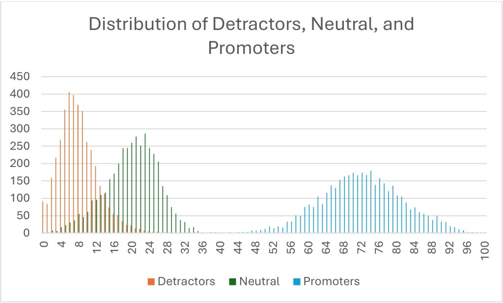
I could say a bunch of things on this visual, but I will focus on three things.
- If the data was truly bimodal, the percentage of red detractors would overlay on top of the blue promoters. That is, the percentages of those two groups would be closer together. They are not. At the very least, the green neutrals should be at the far left end, since neutral people are not taking the survey, according to the myth.
- If it was truly bimodal, the detractors’ curve itself would look like the promoters’ curve. If a bimodal pattern was seen, you would expect either the red detractors’ curve to look fat and short, or the blue promoters’ curve should look skinny and tall. But neither are true. The red detractors’ curve is higher and skinnier (or as my stats nerds would say, it has a higher kurtosis, perhaps demonstrating leptokurtic features). This tells us that there is less variation between hospitals’ detractor scores. In other words, every hospital has essentially the same number of pissed-off patients and the variation is minimal between the above-average, average, and below-average hospitals.
- There is a reason why the blue promoters’ curve is fatter and shorter. It is because this really differentiates between the truly remarkable and the merely average. The wider the range, the more variation. In other words, while both Mayo Clinics and Dear God Why Have You Forsaken Us Medical Center have essentially the same number of detractors, only one has managed to create a large number of promoters.
All of this says that crabby patients are the price of doing business and you are never going to move that number very much. I don’t say this to dismiss crabby patients. They need attention, generally through service recovery strategies. But if you only focus on the happy and the sad, you miss the real differentiator in the data. Those patients who are simply neutral. People who claim only the passionate take surveys are basing this myth upon the patients that they recognize, both happy and angry. The problem is that they don’t notice those who never push the call-light, never ask for a new pillow, do what you ask when you ask and then when they leave, give you a 7.
1The blog post wasn’t about patients, but it was about social science. I will not name-check this person because they deserve no attention (even negative attention) for the garbage that they were passing off as research. Just reflecting on this post is raising my cortisol levels.
2This is a phrase my family has used forever and I have always assumed that everyone understood it. Only later (after quite a few quizzical looks) did I discover that this is not true. “Salting the deck” means engaging in dishonesty or subtle influence to affect the outcome of a game or situation. It is like “stacking the deck.” You might legitimately ask why I simply don’t use the more commonly understood phrase. To that I will say, colloquial variation is the piquant flavor of discourse.
3The only experience I have had with this is a friend of mine who continually participates in SiriusXM surveys expressly to vote down bands he hates rather than to prop up bands he likes. Oddly, this is the only place where this rather disturbing side of his personality comes out.
4 To examine this, I am looking at the most recent HCAHPS data posted to the CMS website. I will be looking only at the Overall Rating question, since it is the only 11-point question on the survey and therefore the only one allowing for using proper net promoter score language. I like this dataset because it is big and inclusive and it is publicly available, so if you want to check my work, you are free to download it yourself and see if I made a mistake.
5This is one place where CMS’s focus on no decimals helps, as the plot could have been seriously crazy if I had to account for a thousand datapoints (or ten-thousand) instead of just 100 datapoints.

Leave a comment